Color
Our color palette is the foundation of our visual identity. It is built to express the contrast between the deep oceans and the sunlit coasts. Use these precise values to ensure consistency across all physical and digital touchpoints.
The 100–900 Scale System
Every core color is accompanied by an extended tonal scale. The 500 value represents the definitive Main Colour and must be used as the primary structural anchor for brand moments.
- Tints (100–400): Mixed with white. Engineered for subtle backgrounds, soft gradients, and interactive hover states.
- Shades (600–900): Mixed with black. Reserved for typography, deep contrast overlays, and sharp focus points to ensure AAA accessibility standards.
Core Palette
The core palette drives the brand's primary voice. Bleue Absolu and Obsidian Black form the structural base, while Alabaster White provides necessary negative space.
Bleue Absolu500 (Main Colour)
Obsidian Black500 (Main Colour)
Alabaster White500 (Main Colour)
Secondary Palette
Secondary colors are used for specific accents, collections, or to distinguish different sensory moods within the brand language.
RB BRAND COLOUR500 (Main Colour)
ÉCORCE NOIRE500 (Main Colour)
ARMOISINE500 (Main Colour)
ARGUMADE500 (Main Colour)
L'EAU PRALINÉE500 (Main Colour)
NOMADE CHIC500 (Main Colour)
PETITE FLEUR500 (Main Colour)
SORBET D'ETE500 (Main Colour)
Brand Patterns
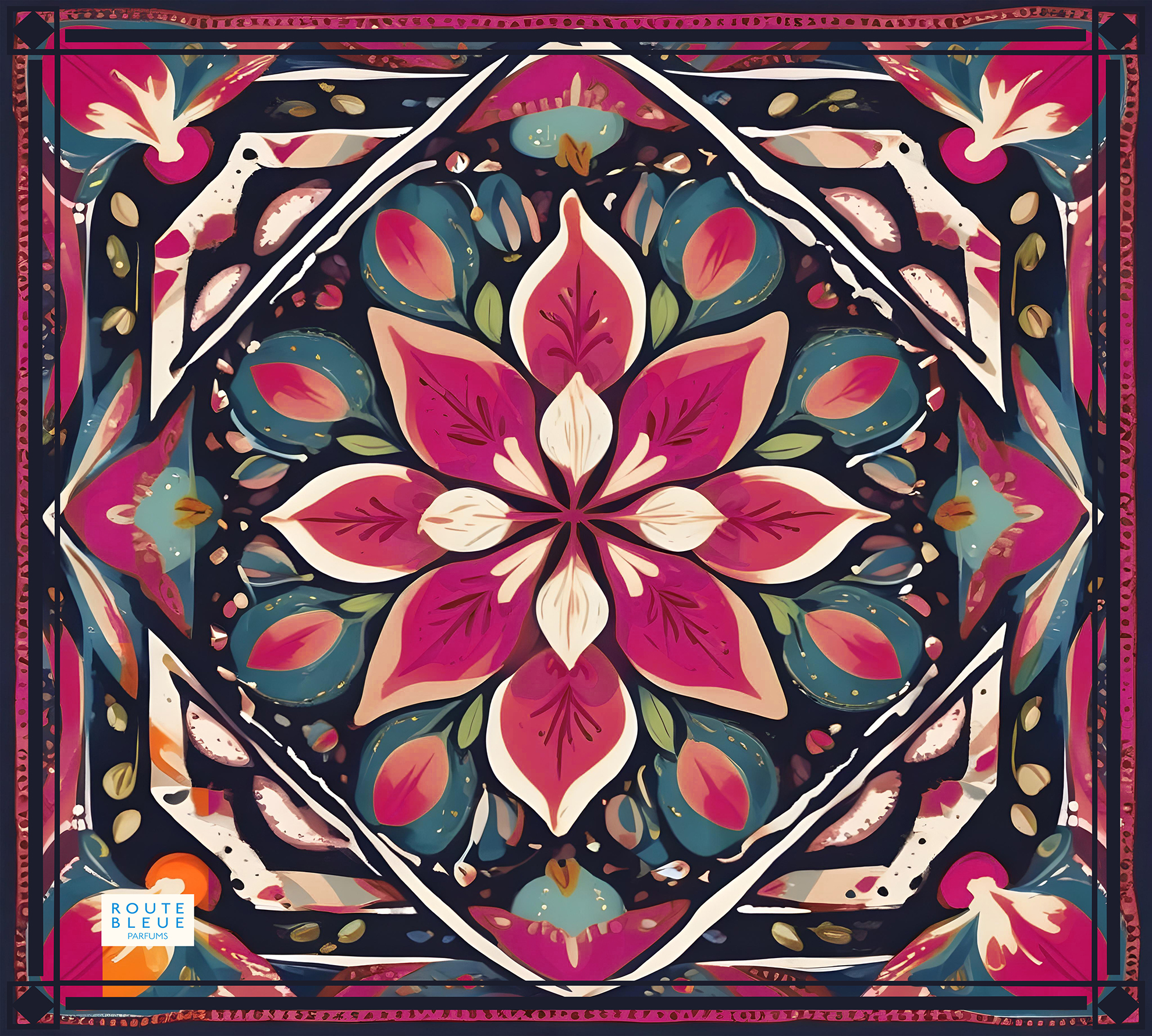
Download the official pattern assets for each fragrance family. These textures are integral to the sensory storytelling and visual packaging of the Route Bleue brand.
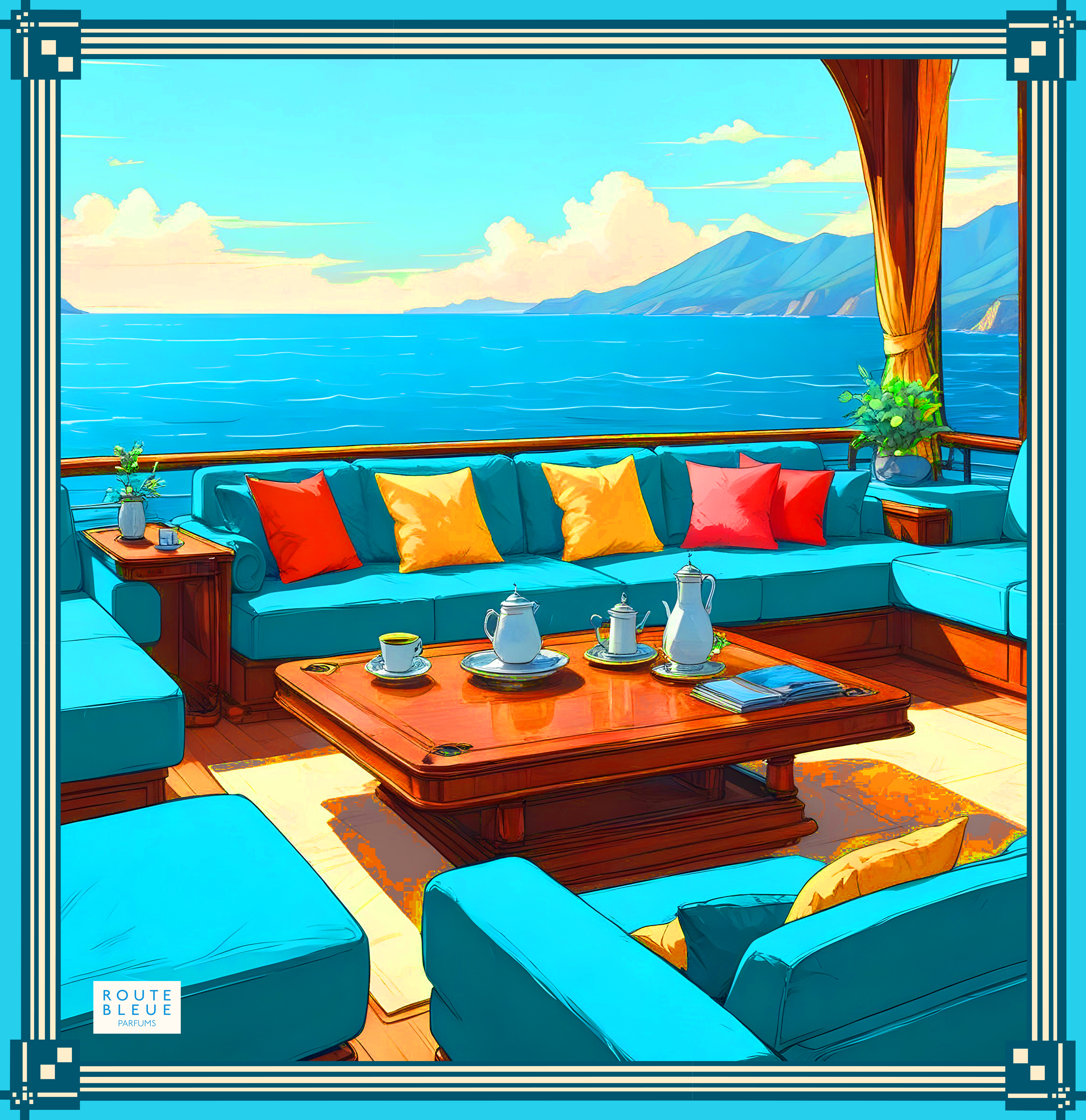
AGRUMADE
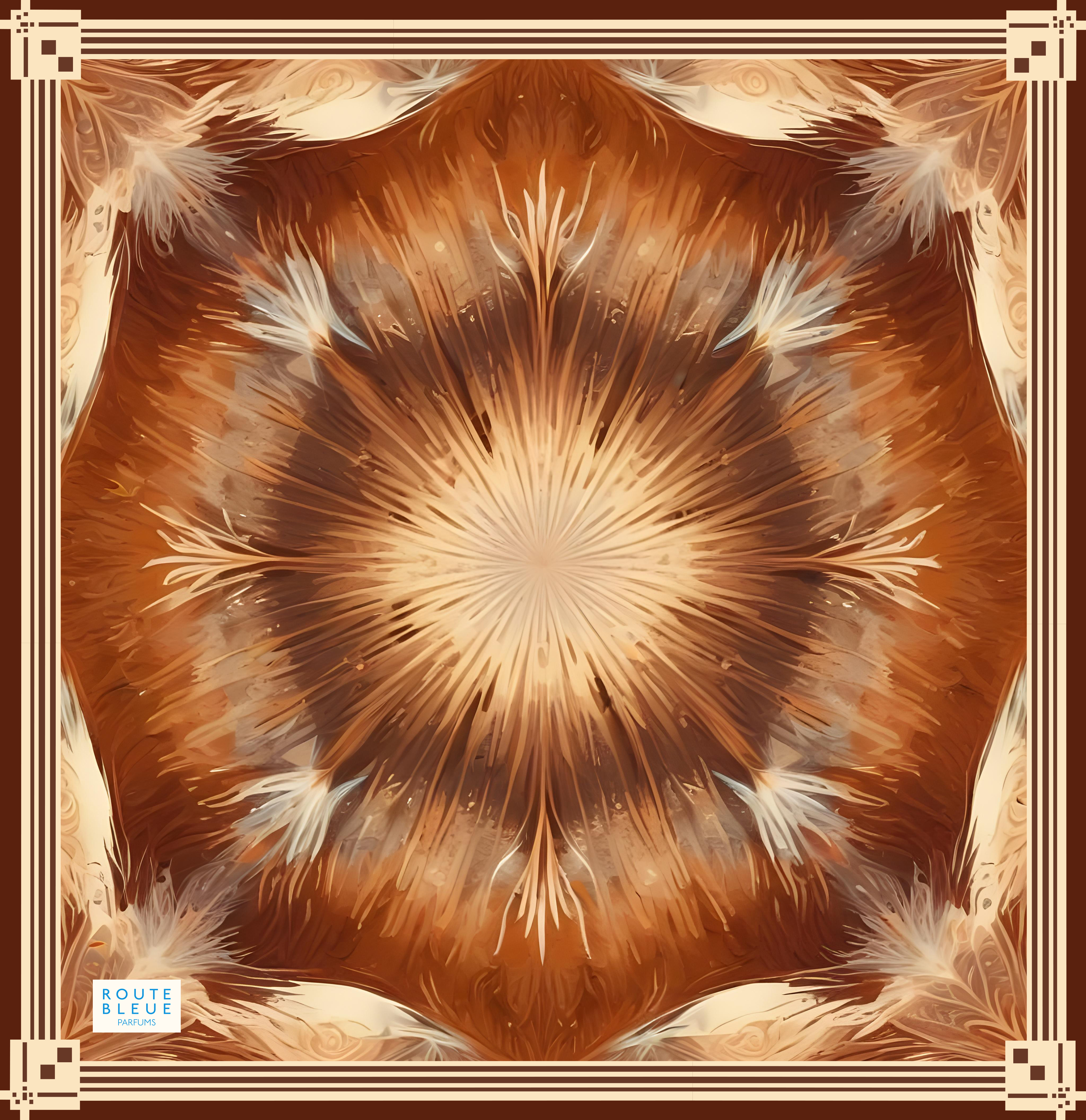
ÉCORCE NOIRE
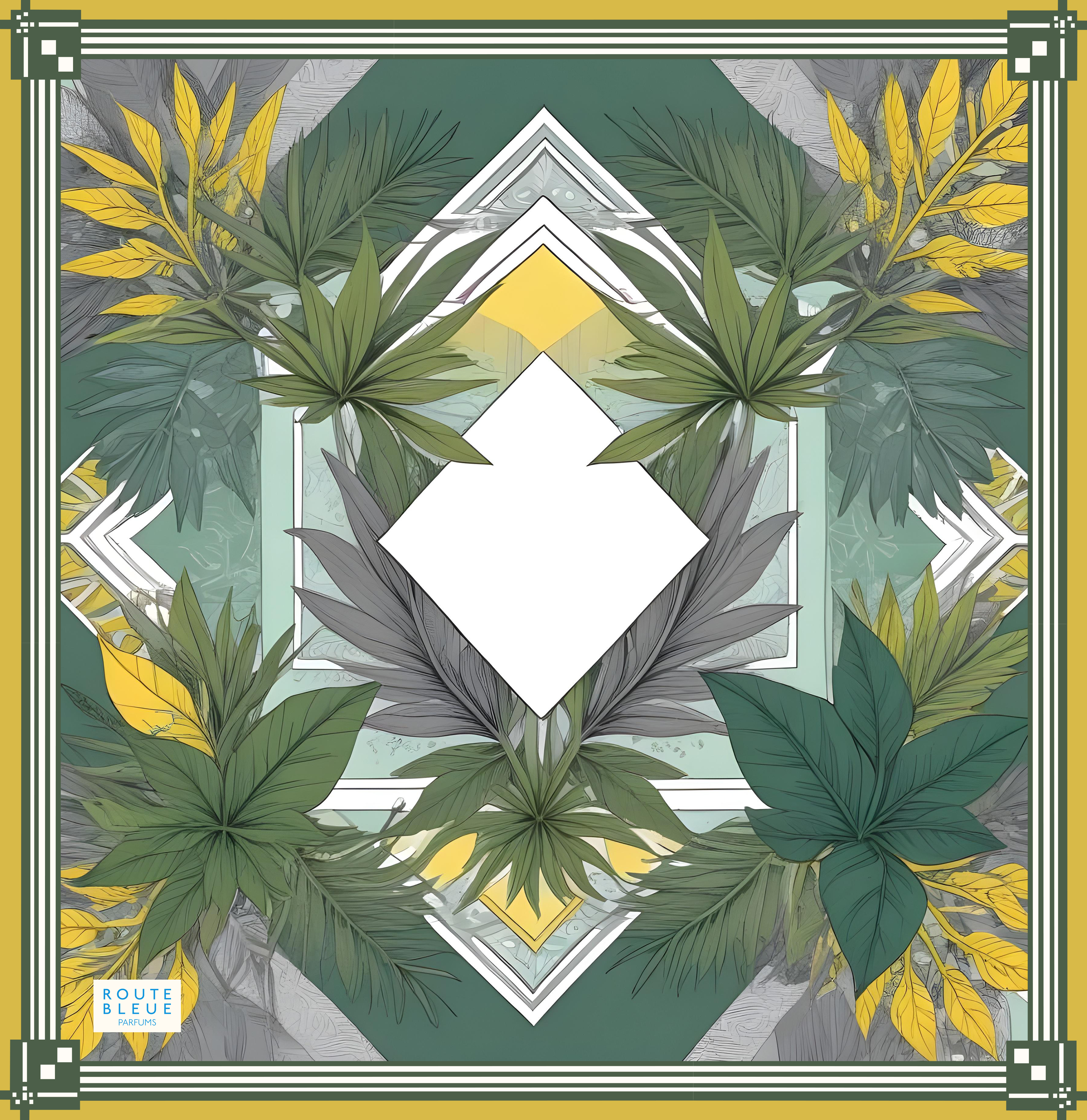
ARMOISINE
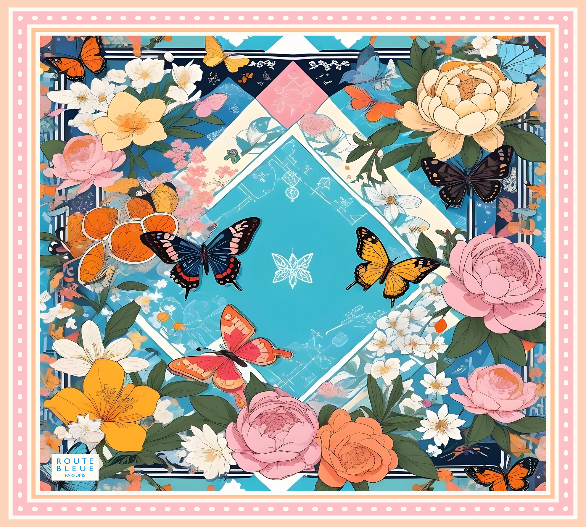
PETITE FLEUR
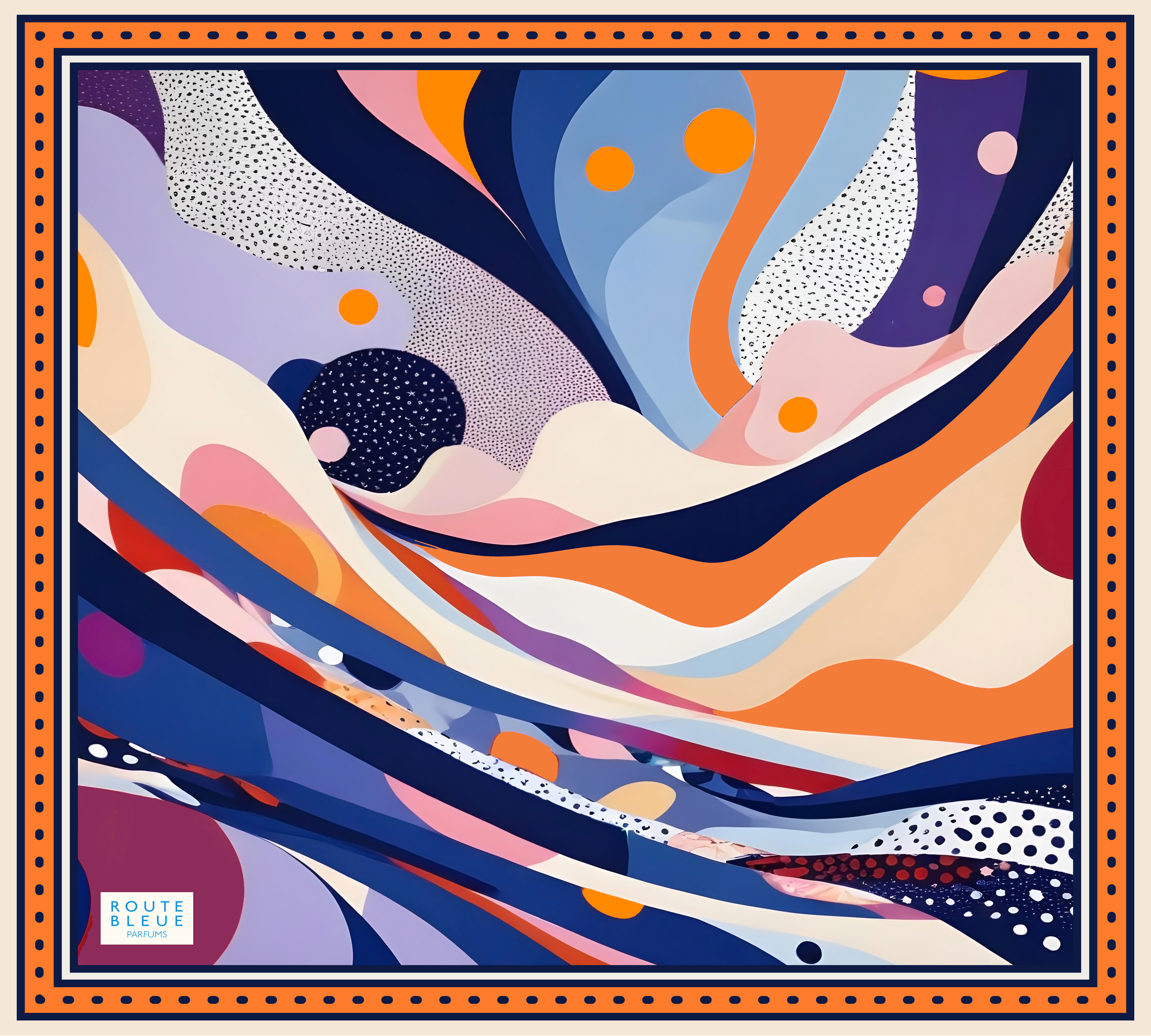
SORBET D'ETE
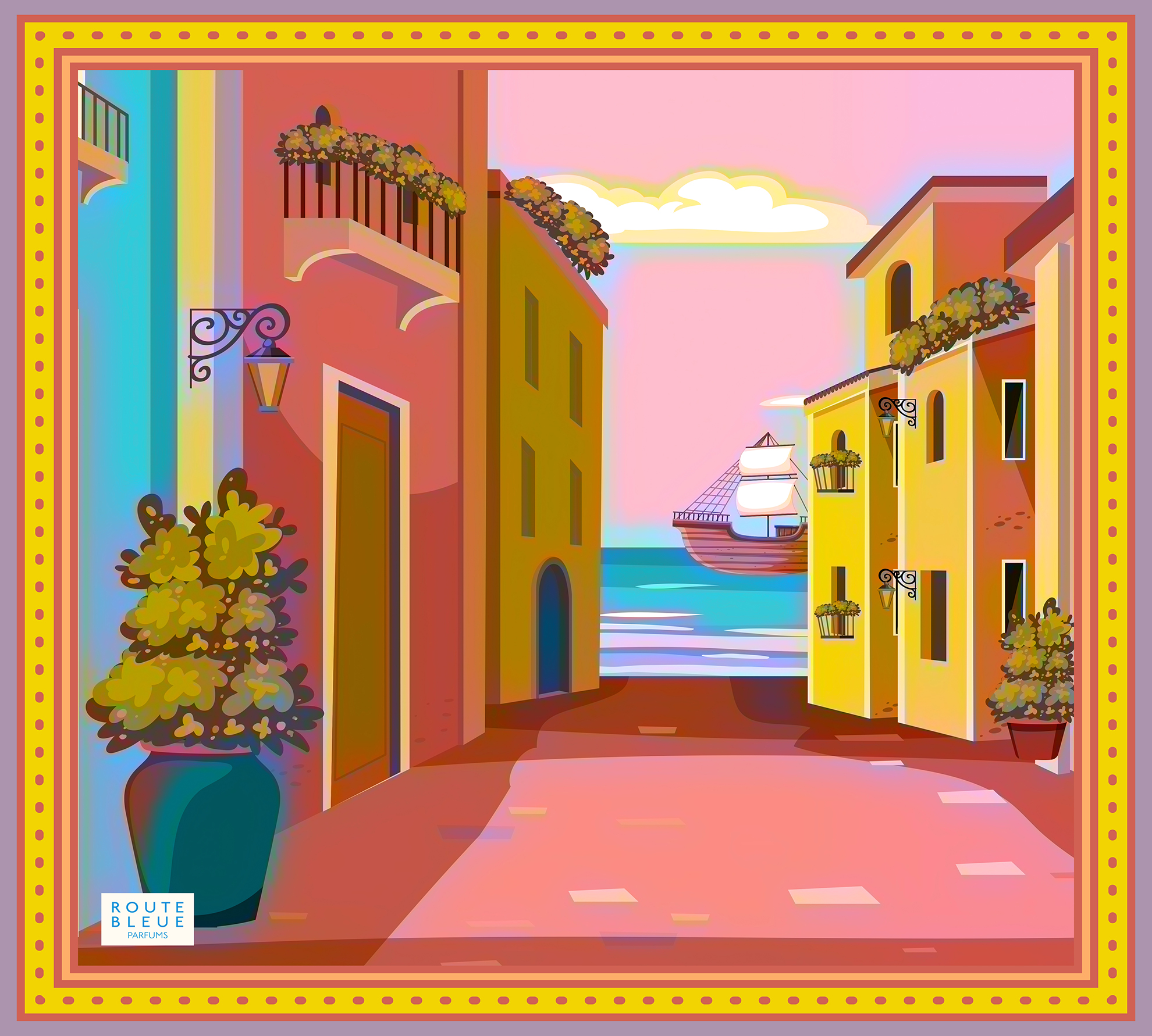
NOMADE CHIC